Use Lexical Editor with Shadcn UI
Lexical is an extensible text editor framework that allows us to create rich text editors with ease. In this tutorial, we will create a simple rich text editor using Lexical and Shadcn UI.
Prerequisites
Before we start, make sure you have set up a React project, with tailwindcss, Lexical and Shadcn UI installed.
Here are some tutorials to help you set up your project:
We will rely on the @lexical/utils package for some utility functions.
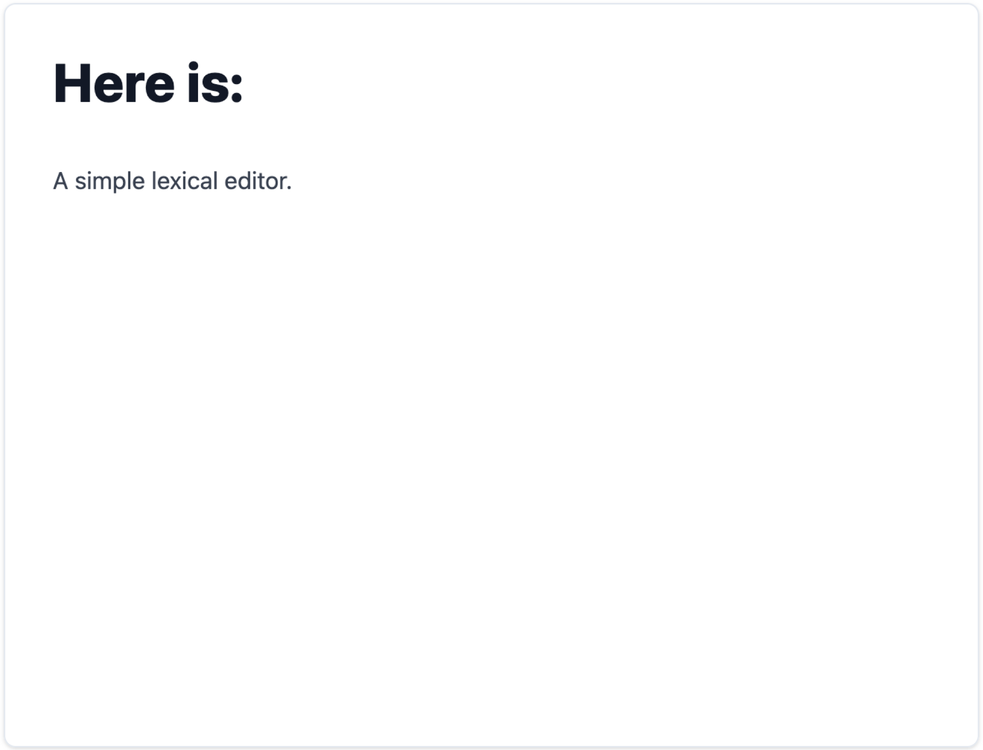
Basic Lexical Editor
For my project, I have a simple Lexical Editor component that uses the RichTextPlugin to render the rich text editor. The RichTextPlugin requires a contentEditable prop, which is a React component that will be rendered as the content editable area.
// src/components/editor/index.tsx

// ...

const Editor: React.FC = () => {
  const config: InitialConfigType = {
    namespace: "lexical-editor",

    nodes: [
      HeadingNode,
      ListNode,
      ListItemNode,
      QuoteNode,
      CodeNode,
      CodeHighlightNode,

      AutoLinkNode,
      LinkNode,
    ],

    onError: (error) => {
      console.error(error);
    },
  };

  return (
    <LexicalComposer initialConfig={config}>
      <div
        className={`mx-auto relative prose dark:prose-invert flex flex-col mt-10 border shadow rounded-lg`}
      >
        {/* The toolbar will be added here */}

        <div className="relative">
          <RichTextPlugin
            contentEditable={
              <ContentEditable className="focus:outline-none w-full px-8 py-4 h-[500px] overflow-auto relative" />
            }
            placeholder={
              <p className="text-muted-foreground absolute top-0 px-8 py-4 w-full pointer-events-none">
                Enter some text...
              </p>
            }
            ErrorBoundary={LexicalErrorBoundary}
          />
          <HistoryPlugin />
        </div>
        {/* <AutoFocusPlugin /> */}
        <ListPlugin />
        <LinkPlugin />

        <MarkdownShortcutPlugin transformers={TRANSFORMERS} />
      </div>
    </LexicalComposer>
  );
};

export default Editor;

export default Editor;
In the above code, we have a config object that contains the configuration for the Lexical Editor. We have defined the theme object, which contains the styles for the editor. We have also defined the nodes array, which contains the nodes that will be rendered in the editor.
The RichTextPlugin component renders the rich text editor. It requires a contentEditable prop, which is a React component that will be rendered as the content editable area. In this case, we are rendering a ContentEditable component.
The LexicalComposer component wraps the RichTextPlugin component and provides the configuration for the editor. We have also added the HistoryPlugin, ListPlugin, and LinkPlugin components to provide additional functionality to the editor.
The code will render a simple rich text editor with a content editable area and a placeholder text.
Add a Toolbar
The toolbar is created using the plugin system in Lexical. The plugin could access the editor instance and render a React component.
Let’s create a new file under src/components/editor/plugins called toolbar-plugin.tsx and add the following code:
// src/components/editor/plugins/toolbar-plugin.tsx
export default function ToolbarPlugin() {
  return <div className="w-full p-2 border-b z-10">Toolbar</div>;
}
Now we need to add the ToolbarPlugin to the Editor component.
// src/components/editor/index.tsx
<LexicalComposer initialConfig={config}>
  <div
    className={`mx-auto relative prose dark:prose-invert flex flex-col mt-10 border shadow rounded-lg`}
  >
    <ToolbarPlugin />
    <div className="relative">{/* ... */}</div>
    <ListPlugin />
    <LinkPlugin />

    <MarkdownShortcutPlugin transformers={TRANSFORMERS} />
  </div>
</LexicalComposer>
Remember to place the ToolbarPlugin component inside the LexicalComposer component. In this way, the plugin will have access to the editor instance.
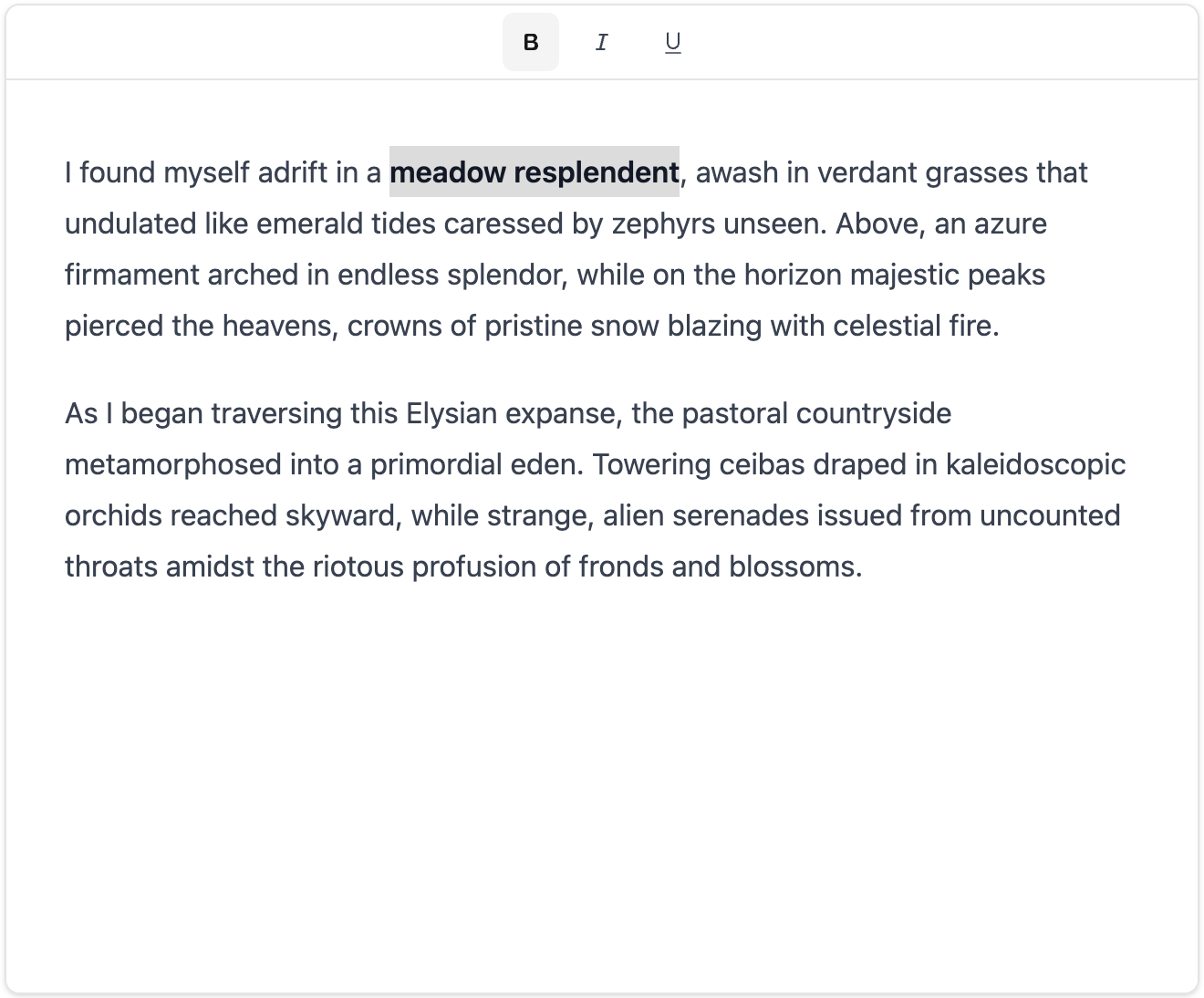
Simple Toolbar Buttons
The toolbar component is ready now! Let’s try to add some simple formatting buttons to the toolbar.
// src/components/editor/plugins/toolbar-plugin.tsx
export default function ToolbarPlugin() {
  const [editor] = useLexicalComposerContext();
  const [isBold, setIsBold] = useState<boolean>(false);
  const [isItalic, setIsItalic] = useState<boolean>(false);
  const [isUnderline, setIsUnderline] = useState<boolean>(false);

  return (
    <div className="w-full p-1 border-b z-10">
      <div className="flex space-x-2 justify-center">
        <Toggle
          area-label="Bold"
          size="sm"
          pressed={isBold}
          onPressedChange={(pressed) => {
            editor.dispatchCommand(FORMAT_TEXT_COMMAND, "bold");
            setIsBold(pressed);
          }}
        >
          <FontBoldIcon />
        </Toggle>

        <Toggle
          area-label="Italic"
          size="sm"
          pressed={isItalic}
          onPressedChange={(pressed) => {
            editor.dispatchCommand(FORMAT_TEXT_COMMAND, "italic");
            setIsItalic(pressed);
          }}
        >
          <FontItalicIcon />
        </Toggle>

        <Toggle
          area-label="Underline"
          size="sm"
          pressed={isUnderline}
          onPressedChange={(pressed) => {
            editor.dispatchCommand(FORMAT_TEXT_COMMAND, "underline");
            setIsUnderline(pressed);
          }}
        >
          <UnderlineIcon />
        </Toggle>
      </div>
    </div>
  );
}
The logic is simple. We have three states for bold, italic, and underline. When the user clicks on the button, we dispatch the FORMAT_TEXT_COMMAND command with the corresponding format.
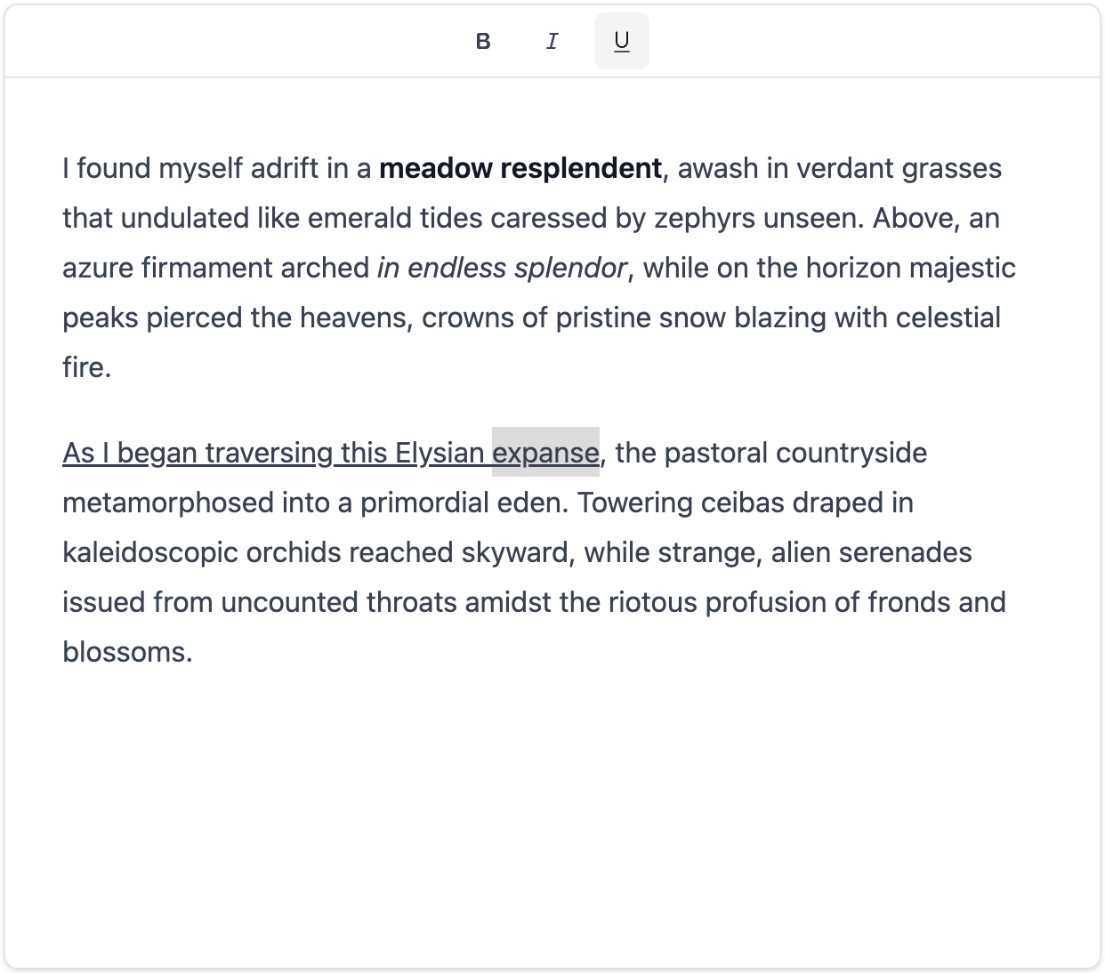
The toolbar seems to work fine. However, we could notice that when the user selects some other text (which are not bold), the bold button is still pressed. We need to update the button state based on the editor state.
Detect Format
const $updateToolbar = useCallback(() => {
  const selection = $getSelection();
  if ($isRangeSelection(selection)) {
    setIsBold(selection.hasFormat("bold"));
    setIsItalic(selection.hasFormat("italic"));
    setIsUnderline(selection.hasFormat("underline"));
  }
}, []);

useEffect(() => {
  return mergeRegister(
    editor.registerCommand(
      SELECTION_CHANGE_COMMAND,
      () => {
        $updateToolbar();
        return false;
      },
      COMMAND_PRIORITY_CRITICAL
    ),
    editor.registerUpdateListener(({ editorState }) => {
      editorState.read(() => {
        $updateToolbar();
      });
    })
  );
}, [editor, $updateToolbar]);
In order to update the toolbar buttons based on the editor state, we need to listen to the SELECTION_CHANGE_COMMAND command. When the selection changes, we update the state of the buttons based on the format of the selected text. We also need to update the toolbar when the editor state changes.
Now the toolbar buttons should update based on the selected text. There’s still a little issue: the underline button is not working as expected. By checking the devtools, we could see that the underlined text is wrapped in a span, but no classnames are added. So we need to make some changes to the initial config.
Add Underline Node
The classnames for formatted node could be customized with theme.
const config: InitialConfigType = {
  namespace: "lexical-editor",

  theme: {
    text: {
      underline: "underline",
    },
  },

  // ...
};
The theme object contains the classnames for the formatted nodes. In this case, we have added a underline classname for the underline format. The styles will be applied by @tailwindcss/typography. Now the simple buttons should work as expected!
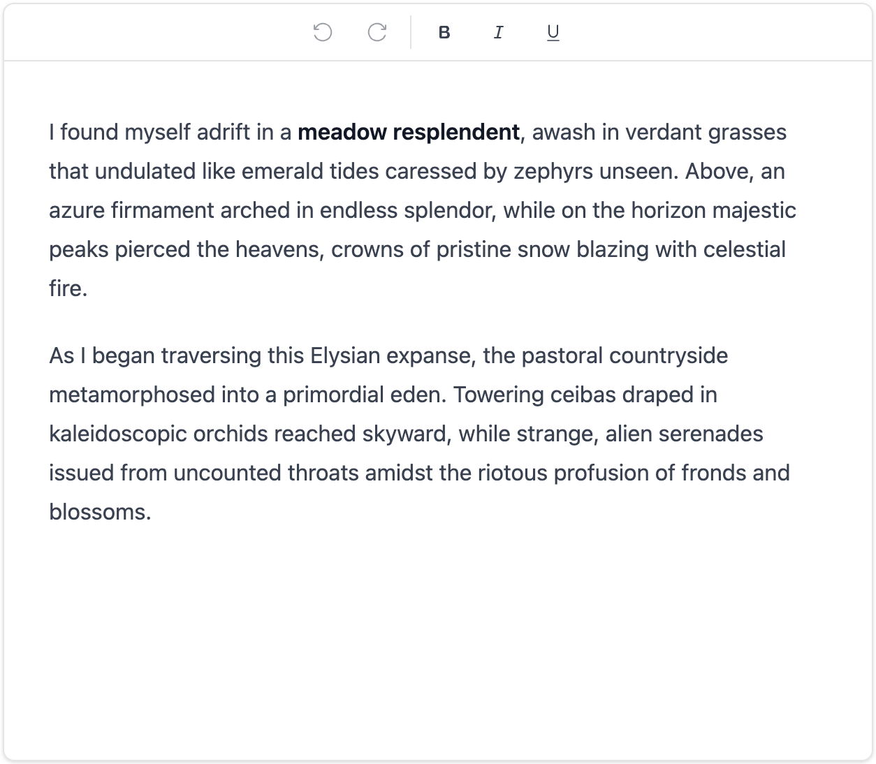
Undo and Redo
The HistoryPlugin provides undo and redo functionality to the editor. In the toolbar, we could trigger undo and redo with UNDO_COMMAND and REDO_COMMAND. Also, we could listen to the CAN_UNDO_COMMAND and CAN_REDO_COMMAND commands to update the button state.
Here’s how to add undo and redo buttons to the toolbar:
export default function ToolbarPlugin() {
  // ...
  const [canUndo, setCanUndo] = useState<boolean>(false);
  const [canRedo, setCanRedo] = useState<boolean>(false);

  // ...
  useEffect(() => {
    return mergeRegister(
      editor.registerCommand(
        CAN_UNDO_COMMAND,
        (payload) => {
          setCanUndo(payload);
          return false;
        },
        COMMAND_PRIORITY_CRITICAL
      ),
      editor.registerCommand(
        CAN_REDO_COMMAND,
        (payload) => {
          setCanRedo(payload);
          return false;
        },
        COMMAND_PRIORITY_CRITICAL
      )
    );
  }, [editor]);

  // ...
  return (
    <div className="w-full border-b z-10 relative">
      <div className="flex space-x-2 justify-center p-1">
        <Button
          className="h-8 px-2"
          variant={"ghost"}
          disabled={!canUndo}
          onClick={() => editor.dispatchCommand(UNDO_COMMAND, undefined)}
        >
          {/* reload flip to left */}
          <ReloadIcon className="transform -scale-x-100" />
        </Button>

        <Button
          className="h-8 px-2"
          variant={"ghost"}
          disabled={!canRedo}
          onClick={() => editor.dispatchCommand(REDO_COMMAND, undefined)}
        >
          <ReloadIcon />
        </Button>

        <Separator orientation="vertical" className="h-auto my-1" />
        {/* ... */}
      </div>
    </div>
  );
}
mergeRegister is a helper function that registers multiple commands at once. We listen to the CAN_UNDO_COMMAND and CAN_REDO_COMMAND commands to update the button state, where the payload is the updated CAN_UNDO and CAN_REDO value. When the user clicks on the undo or redo button, we dispatch the UNDO_COMMAND or REDO_COMMAND command. Notice that the second argument of the dispatchCommand function is undefined because the command does not require any payload.
Now the toolbar should look like this:
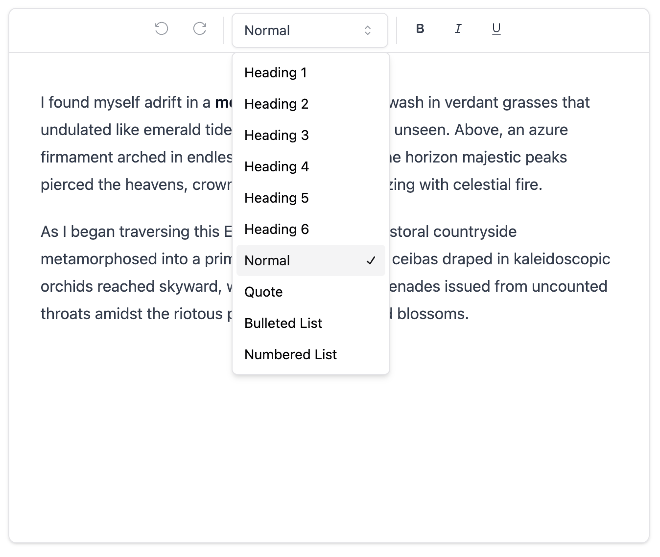
Block Type Dropdown
We could add a dropdown to the toolbar to select the block Type (paragraph, heading, etc.). For code clarity, we could create a new component called BlockTypeDropdown.
// src/components/editor/plugins/components/block-type-dropdown.tsx
interface BlockTypeDropdownProps {
  blockType: keyof typeof blockTypeToBlockName;
}

export default function BlockTypeDropdown({
  blockType,
}: BlockTypeDropdownProps) {
  const [editor] = useLexicalComposerContext();

  const formatHeading = (headingLevel: HeadingTagType) => {
    editor.update(() => {
      const selection = $getSelection();
      $setBlocksType(selection, () => $createHeadingNode(headingLevel));
    });
  };

  const formatParagraph = () => {
    editor.update(() => {
      const selection = $getSelection();
      $setBlocksType(selection, () => $createParagraphNode());
    });
  };

  const formatOrderedList = () => {
    if (blockType !== "number") {
      editor.dispatchCommand(INSERT_ORDERED_LIST_COMMAND, undefined);
    } else {
      editor.dispatchCommand(REMOVE_LIST_COMMAND, undefined);
    }
  };

  const formatUnorderedList = () => {
    if (blockType !== "bullet") {
      editor.dispatchCommand(INSERT_UNORDERED_LIST_COMMAND, undefined);
    } else {
      editor.dispatchCommand(REMOVE_LIST_COMMAND, undefined);
    }
  };

  const formatQuote = () => {
    editor.update(() => {
      const selection = $getSelection();
      $setBlocksType(selection, () => $createQuoteNode());
    });
  };

  return (
    <Select
      value={blockType}
      onValueChange={(value) => {
        switch (value) {
          case "h1":
            formatHeading("h1");
            break;
          case "h2":
            formatHeading("h2");
            break;
          case "h3":
            formatHeading("h3");
            break;
          case "h4":
            formatHeading("h4");
            break;
          case "h5":
            formatHeading("h5");
            break;
          case "h6":
            formatHeading("h6");
            break;
          case "paragraph":
            formatParagraph();
            break;
          case "number":
            formatOrderedList();
            break;
          case "bullet":
            formatUnorderedList();
            break;
          case "quote":
            formatQuote();
            break;
        }
      }}
    >
      <SelectTrigger className="w-40">
        <SelectValue placeholder="Block Type" />
      </SelectTrigger>

      <SelectContent>
        {Object.keys(blockTypeToBlockName).map((blockType) => {
          return (
            <SelectItem key={blockType} value={blockType}>
              {blockTypeToBlockName[blockType]}
            </SelectItem>
          );
        })}
      </SelectContent>
    </Select>
  );
}
The BlockTypeDropdown component receives the blockType prop, which is the current block type. When the user selects a block type from the dropdown, we dispatch the corresponding command to the editor.
// src/components/editor/plugins/components/block-types.ts
export const blockTypeToBlockName: Record<string, string> = {
  h1: "Heading 1",
  h2: "Heading 2",
  h3: "Heading 3",
  h4: "Heading 4",
  h5: "Heading 5",
  h6: "Heading 6",
  paragraph: "Normal",
  quote: "Quote",
  bullet: "Bulleted List",
  number: "Numbered List",
};
Now we could add the BlockTypeDropdown component to the ToolbarPlugin.
// ...
const [blockType, setBlockType] =
  useState<keyof typeof blockTypeToBlockName>("paragraph");

// ...
<BlockTypeDropdown blockType={blockType} />;
Also, we need to update the block type when the selection changes.
const $updateToolbar = useCallback(() => {
  const selection = $getSelection();
  if ($isRangeSelection(selection)) {
    setIsBold(selection.hasFormat("bold"));
    setIsItalic(selection.hasFormat("italic"));
    setIsUnderline(selection.hasFormat("underline"));

    const anchorNode = selection.anchor.getNode();

    let element =
      anchorNode.getKey() === "root"
        ? anchorNode
        : $findMatchingParent(anchorNode, (e) => {
            const parent = e.getParent();
            return parent !== null && $isRootOrShadowRoot(parent);
          });

    if (element === null) {
      element = anchorNode.getTopLevelElementOrThrow();
    }

    const elementDOM = editor.getElementByKey(element.getKey());

    if (elementDOM !== null) {
      if ($isListNode(element)) {
        const parentList = $getNearestNodeOfType<ListNode>(
          anchorNode,
          ListNode
        );
        const type = parentList
          ? parentList.getListType()
          : element.getListType();
        setBlockType(type);
      } else {
        const type = $isHeadingNode(element)
          ? element.getTag()
          : element.getType();
        if (type in blockTypeToBlockName) {
          setBlockType(type as keyof typeof blockTypeToBlockName);
        }
      }
    }
  }
}, [editor]);
In the above code, we update the block type based on the selected text. If the selected text is a list node, we set the block type to the list type. If the selected text is a heading node, we set the block type to the heading tag. Otherwise, we set the block type to the node type.
Now the toolbar should look like this:
Conclusion
In this tutorial, we have created a simple rich text editor using Lexical and Shadcn UI. We have added a toolbar with simple formatting buttons, undo and redo buttons, and a block type dropdown. We have also updated the toolbar buttons based on the editor state.
The complete code for this tutorial is available on GitHub. If you find this tutorial helpful, please give it a star! Happy coding!